Maps
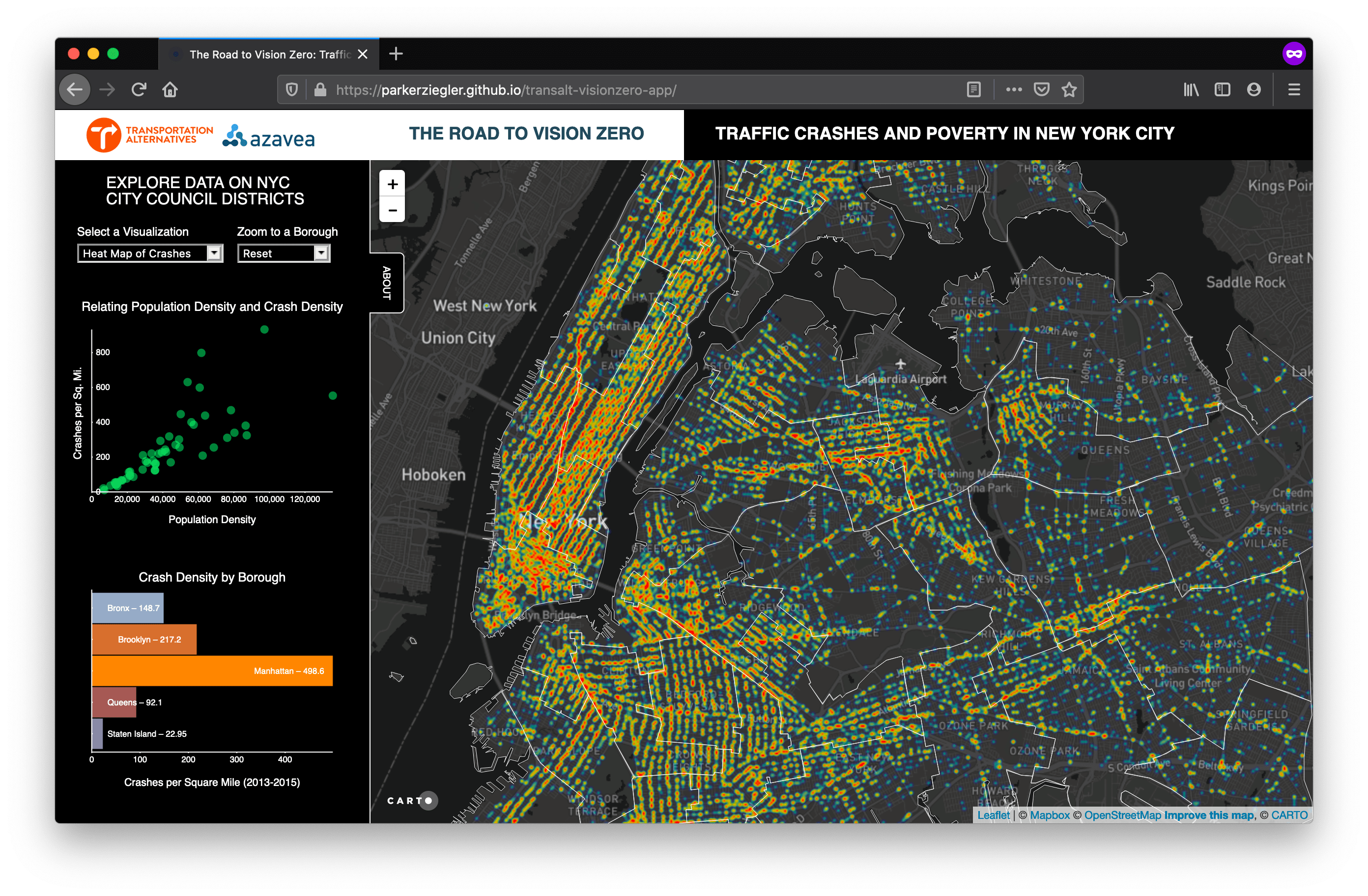
The Road to Vision Zero: Traffic Crashes and Poverty in New York City
This web application, developed as part of Azavea's Summer of Maps fellowship, is designed to help users explore and visualize relationships between traffic crashes and poverty in New York City. After significant pressure from community organizations, local businesses, and victims of traffic violence, Mayor Bill De Blasio launched the city's Vision Zero campaign in 2014. The campaign, based off Sweden's Vision Zero design initiative, is based on the principle that no loss of life on our streets is acceptable. However, Vision Zero NYC makes no direct mention of exploring relationships between the density of crashes in different parts of the city and socioeconomic and demographic variables like poverty rate, median income, unemployment, or population density. This despite the fact that researchers are uncovering statistically significant relationships showing a higher incidence of traffic crashes in lower income communities of color, mainly as a result of poor urban design and a lack of appropriate transportation infrastructure.
This application, built on D3, CARTO, Leaflet, and jQuery, attempts to fill this gap in the Vision Zero literature by visualizing these relationships both geographically and statistically in a single integrated interface.
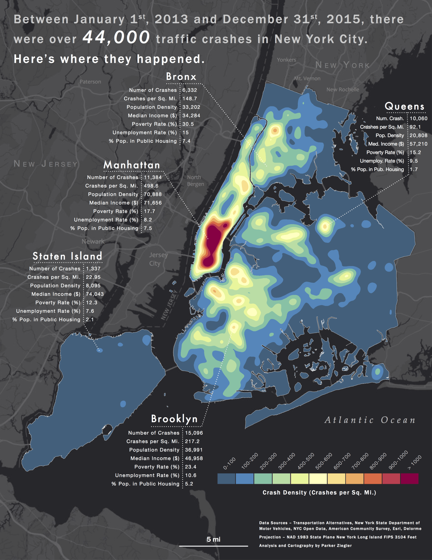
The Road to Vision Zero: Correlating Class, Race, and Traffic Safety in New York City
This set of maps, designed for Transportation Alternatives as part of Azavea's Summer of Maps fellowship, seeks to 1) identify clusters of traffic crashes in New York City between 2013 and 2015 and 2) theorize relationships between the density of crashes and local measures of poverty. The results of this spatial analysis show a clear trend – areas with higher concentrations of traffic crashes tend to have higher poverty rates, lower median incomes, and be more densely populated.
The collection includes a citywide analysis with economic profiles of each borough alongside analysis of vulnerable city council districts within each borough. To get a more holistic sense of this project, check out the project description on Azavea's website. Special thanks to Daniel McGlone, Senior GIS Analyst at Azavea, for his mentorship on this project.
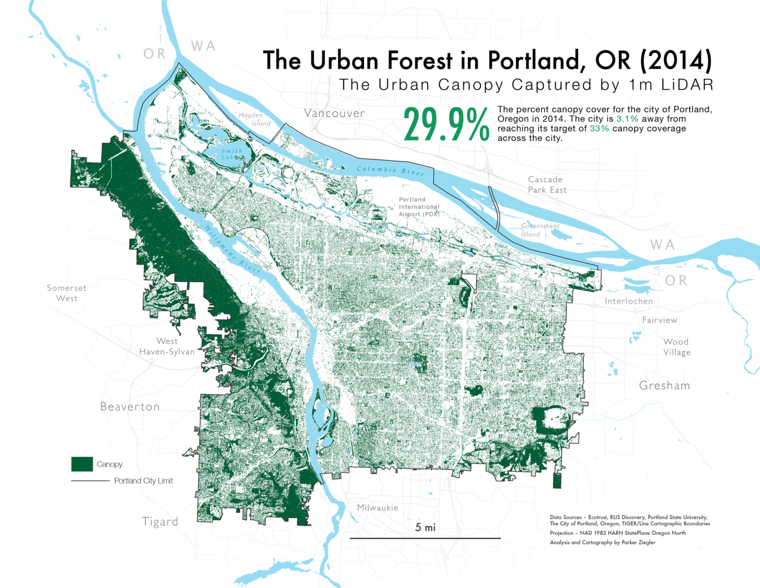
Mapping Portland's Urban Canopy
This set of maps, designed for Ecotrust and the Portland Urban Forestry Commission as part of Azavea's Summer of Maps fellowship, takes an in-depth look at the state of Portland's urban canopy in 2014. The maps in this series fall into two main sets. The first shows the percent canopy cover of different areal units across the city. The second set focuses on the proximity of each areal unit to target canopy goals set in the Urban Forestry Management Plan, helping to identify areas of the city that remain substantially underforested. Maps were generated using ArcGIS and final cartographic work was performed in Adobe Illustrator. To get a more holistic sense of this project, check out the project description on Azavea's website. Special thanks to Esther Needham, Data Analytics Project Manager at Azavea, for her mentorship on this project.
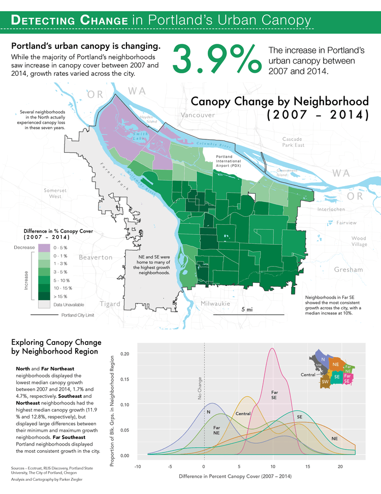
Detecting Change in Portland's Urban Canopy
These two layouts, designed for Ecotrust and the Portland Urban Forestry Commissionas part of Azavea's Summer of Maps fellowship, help to tell two fascinating stories about Portland's urban forest. The first – a result of high resolution change detection analysis using a combination of LiDAR and NAIP multispectral imagery – visualizes how Portland's urban forest has evolved at multiple geographic and temporal scales. The second – a result of geographically weighted regression – attempts to pinpoint some of the main drivers and correlates of canopy distribution, including race, education, home ownership, and population density. Maps were generated using ArcGIS, graphics were generated using the R statistical programming language, both were polished in Adobe Illustrator, and the layouts designed in Adobe InDesign.

Unseen, Unheard, and Forgotten: Child Migration from Central America to the United States
This layout, created as part of Middlebury College's 2016 Cartographic Design seminar, takes a look at the migration of unaccompanied children from the Central American countries of Honduras, El Salvador, and Guatemala to the United States. In 2014, the number of unaccompanied child migrants attempting to make the passage into the U.S. hit a critical spike, pushing President Obama to call the crisis a “humanitarian situation.”
In this layout, I explore three different geographies of the child migration stream. The first map shows the number of child migrants apprehended along each sector of the U.S. – Mexico border in 2014, with orange lines representing the number of child migrants attempting to cross the border and red lines representing the number of U.S. Customs and Border Protection (CBP) staff. The second map zooms in to the border crossing at the Rio Grande Valley, where 73% of apprehended child migrants attempted the passage. The third map shows the actual migration paths these children take from their homes in Central America to reach the border. The graphics help to illustrate where these child migrants are coming from, as well as the fluctuations in migration patterns from 2013 to 2015.
My hope with this layout is to tell a compelling, honest story about the child refugees on our doorstep. In attempting to do so, I also acknowledge the incompleteness of this story, and the many ways in which this layout fails to represent the lived experiences of the many children who attempt this dangerous journey. These maps are dedicated to them.
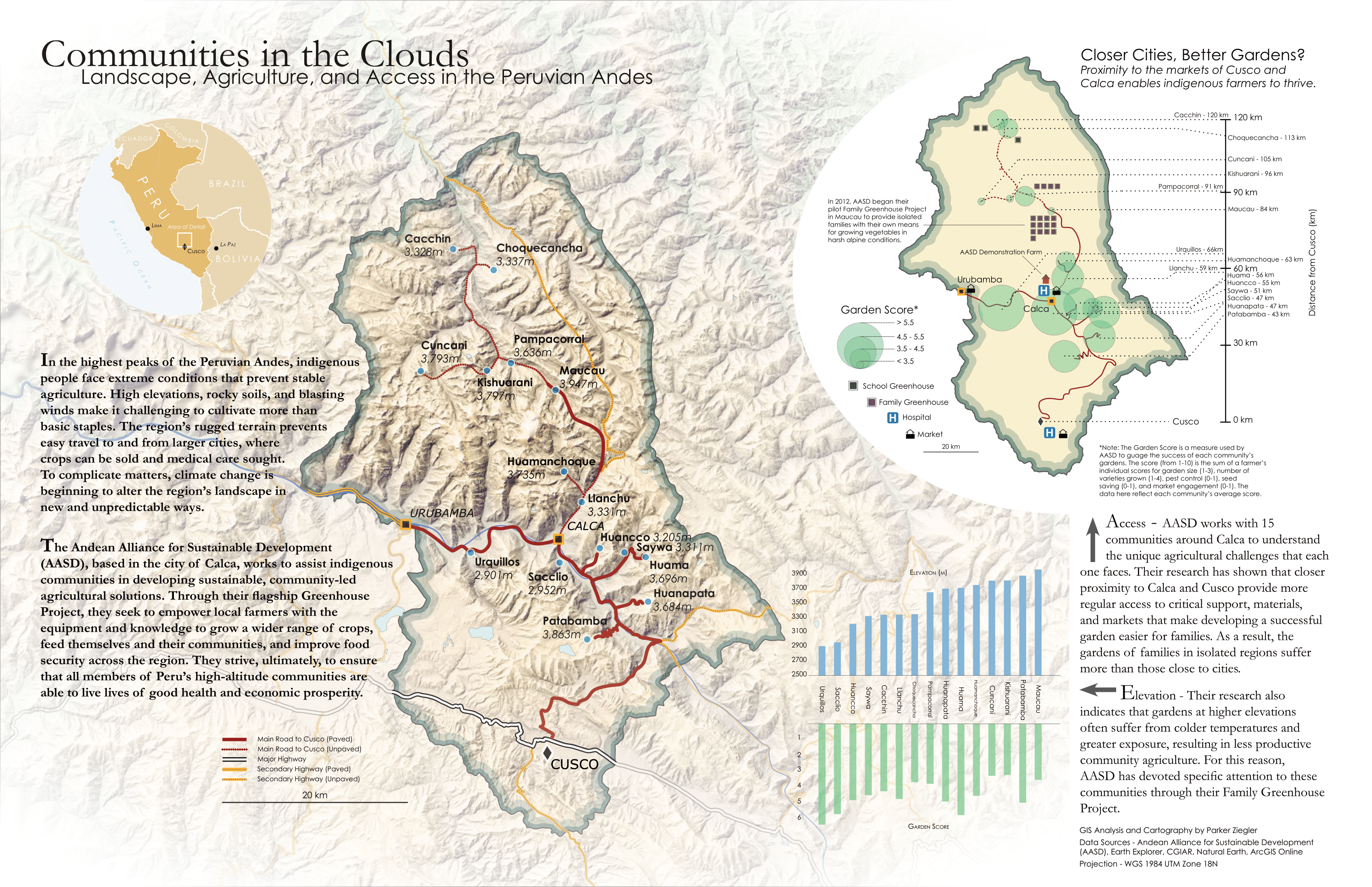
Communities in the Clouds: Landscape, Agriculture, and Access in the Peruvian Andes
This layout, made as part of Middlebury College's 2016 Cartographic Design seminar, brings together several advanced cartographic techniques to tell a unique story about the indigenous communities of the southern Peruvian Andes. Working in collaboration with the Andean Alliance for Sustainable Development (AASD), I designed this layout to discuss the challenges these communities face with respect to agriculture and social service access. I also sought to highlight some of the ways AASD is helping local farmers to integrate their indigenous knowledge with high altitude growing practices to create a more stable agricultural system in the region.
The shaded relief I created for this layout draws inspiration from the work of two marvelous cartographers – Eduard Imhof and Tom Patterson. Imhof's work, particularly his thoughts on slope illumination and aerial perspective, formed the design basis for this piece. Patterson's shaded relief tutorials were my technical guides to achieving these effects – and quite wonderful guides they were.
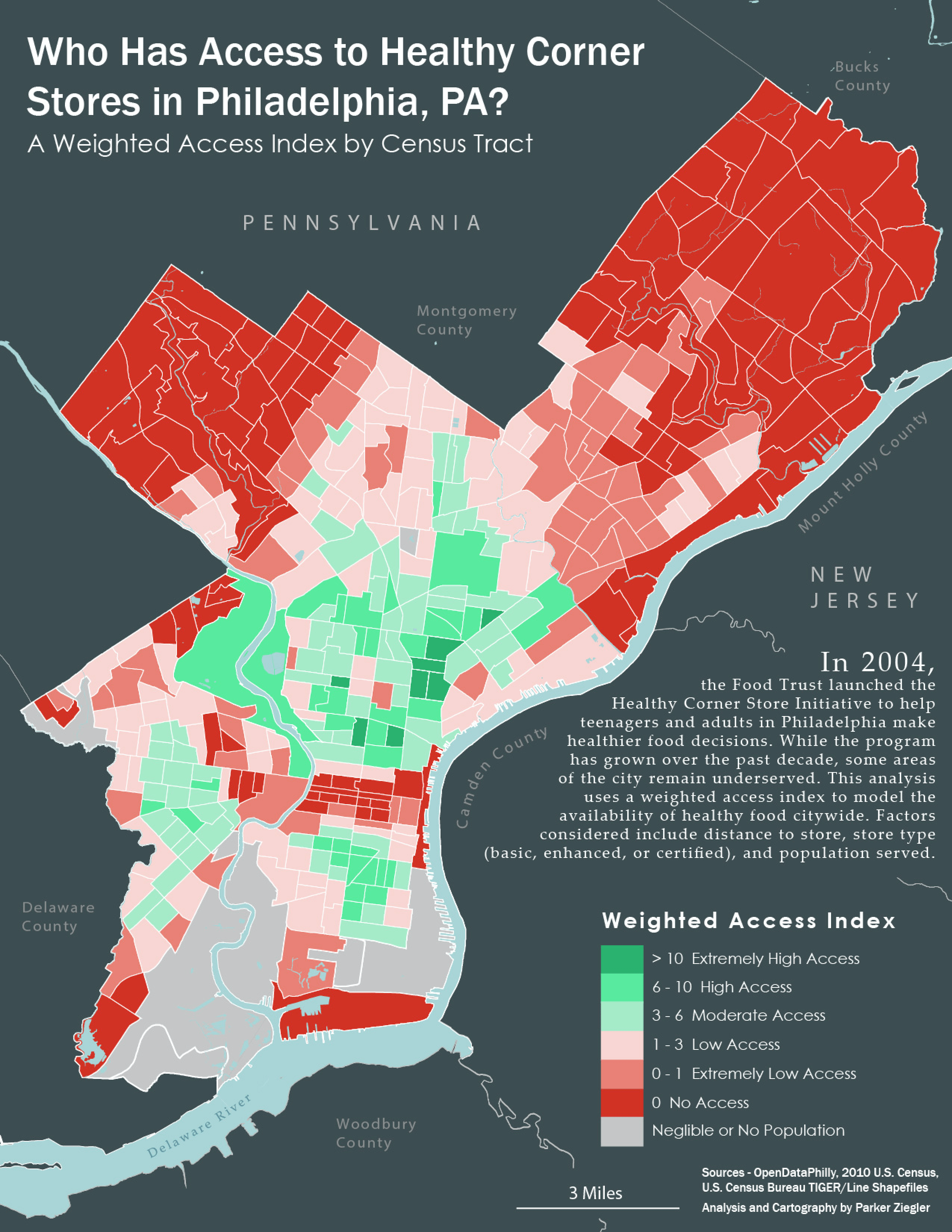
Who Has Access to Healthy Corner Stores in Philadelphia, PA?
This map, designed as part of the application process for Azavea's 2016 Summer of Maps fellowship, takes a look at access to healthy corner stores in Philadelphia. Broken down by Census tracts, I used a combination of distance and quality metrics to pick out those tracts that are already well-served by healthy corner stores and those that are severely underserved. I then aggregated these metrics in a weighted access index to better quantify the data. As a community resource, healthy corner stores increase residents' access to fresh, local, and sustainable food sources. Learn more about Philadelphia's Healthy Corner Store Initiative.
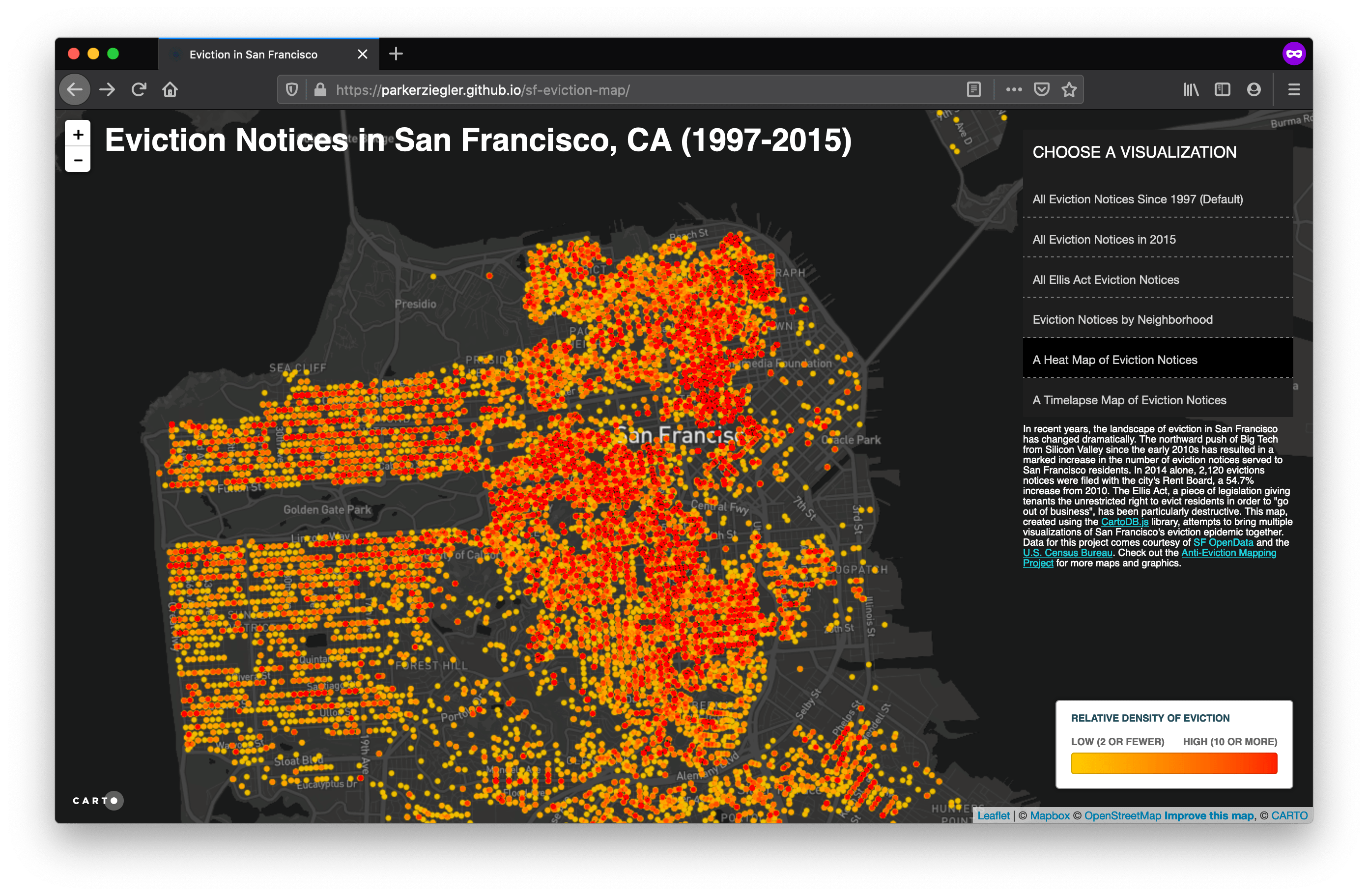
Eviction Notices in San Francisco, CA (1997-2015)
This map, my first foray into the world of interactive and web-based cartography, combines multiple visualizations to shed light on the geography of eviction in San Francisco, CA. Since the northward movement of Big Tech began in the early 2010s, low-income residents have increasingly been priced out and pushed out of their homes. In particular, neighborhoods like the Mission, the Sunset, the Castro, and the Haight-Ashbury have seen rapid and violent change, with extreme increases in home value prices and monthly rent. The Ellis Act, a piece of legislation giving businesses the unrestricted right to evict tenants in order to “go out of business,” has given way to an arbitrary and aggressive regime of real estate speculation backed by big capital. For more information on San Francisco's eviction epidemic, check out the Anti-Eviction Mapping Project. Data for this map came courtesy of SF Open Data and the U.S. Census Bureau. To learn more about how this map was made and designed – and to access the code working behind it – check out this post over on my Thoughts page.
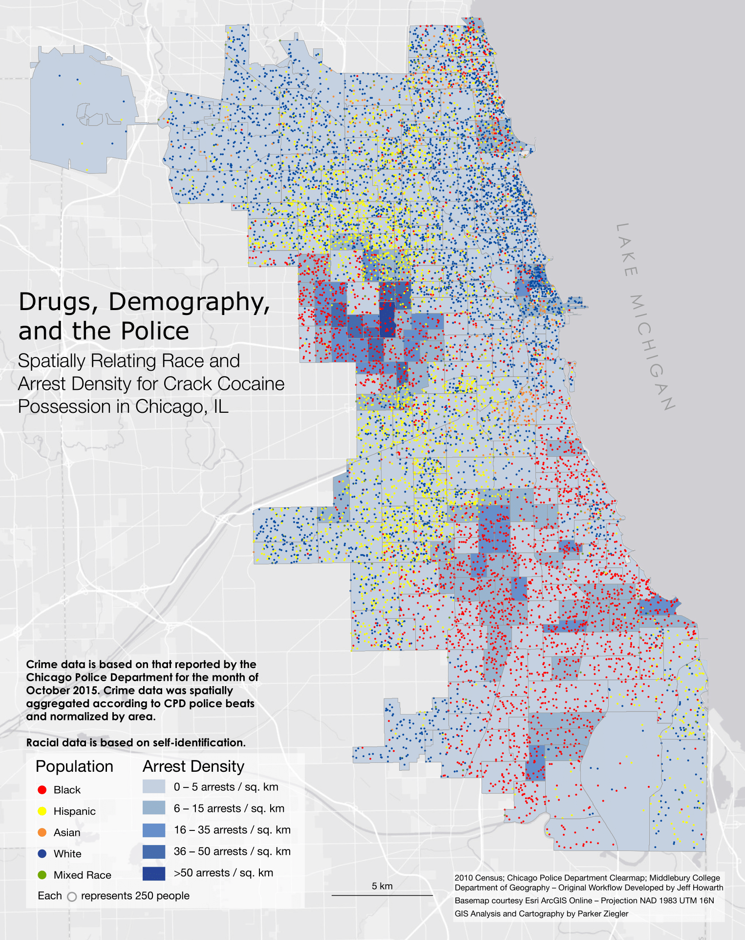
Drugs, Demography, and the Police: Spatially Relating Race and Arrest Density for Drug Possesion in Chicago, IL
This map, which takes its cue from Bill Rankin's dot density map of Chicago, takes a look at the spatial relationship between race and arrest density for possession of three different drugs – marijuana, powder cocaine, and crack cocaine – in Chicago, Illinois. Similar to Rankin's map, I used a dot density style to show the racial segregation of the city; however, I altered the value of each dot to represent 250 people, rather than the 25 people per dot value used by Rankin. This allowed the choropleth layer underneath to come through.
The choropleth layer represents an arrest density for possession of the highlighted drug for the month of October 2015, as reported by the Chicago Police Department. I spatially aggregated the crime data by the Chicago Police Department's police beats using a method known as areal weighted reaggregation (AWR). This allows us to see the police beats in which arrests for possession of these different drugs are particularly high. The South and West Side appear to experience the most aggressive policing for possession of marijuana and crack cocaine, while transitional border areas between Latino and white communities are more heavy policed for powder cocaine possession. In general, it is startling to see how closely higher policing rates are spatially correlated with communities of color. Indeed, the data provide convincing evidence that racial profiling still informs how the state thinks about drugs, policing, and whose behavior is considered “criminal”.
I believe it is important to give credit where credit is due, and I want to recognize Professor Jeff Howarth for developing the original GIS workflow to make this map. Following his lead, I made several alterations and decisions of my own (with respect to normalization, symbology, drugs studied, cartographic design, and operation parameters) to make these maps uniquely my own. To get the data and begin mapping for yourself, head over to the extensive Chicago Data Portal.