Build a Map of Eviction in San Francisco with CartoDB.js
Throughout this semester, through all of the small victories and the frustrations and the beautiful journey of self-directed learning, I've always had one key goal at the front of my mind – make a map, exclusively through code, that I believe in. This has become a more and more difficult challenge for me as I've expanded my cartographic skills and interests into different realms and more complex politics. I have come to expect more of myself, both in terms of the design and the aesthetics of my maps as well as the epistemologies and methodologies that underlie them. I don't know if I would necessarily go so far as to call all of my maps "lies" (as Monmonier might), but, in practicing self-reflexivity in my cartographic design process, I have learned that they are certainly far from being objective "truth". Maps reflect their creators' perspectives and views of the world; not only that, they channel particular ways of viewing, seeing, engaging with, and understanding the world that are dependent on the tools used to make them. That will always be the map's limitation. But rather than seeing maps only for their limitations, for their role as imperfect representations of a world that is inherently messy and complex, perhaps we can think of them differently – as individual experiences and expressions that can have meaning for others beyond the cartographer. Pieces of art that can inspire. Beautiful data that can inform. Little worlds unto themselves.
This philosophy influenced how I designed this map of eviction in San Francisco. When I was out in the Bay for AAG, I found myself often interested in exploring the geographies of the city even more than those I addressed at the conference. Having the chance to walk through the Mission, the Castro, the Sunset, the Richmond, to look and observe and understand so little (but feel so much) about those places, to get a momentary picture of a city undergoing fundamental and violent change – it forced me to think deeply and critically about my own experiences living in cities, and my own participation in gentrification and forced displacement. My own complicity. For this reason, I wanted to try to reckon with this part of my history and my identity through the crafts that I love – cartography and code.
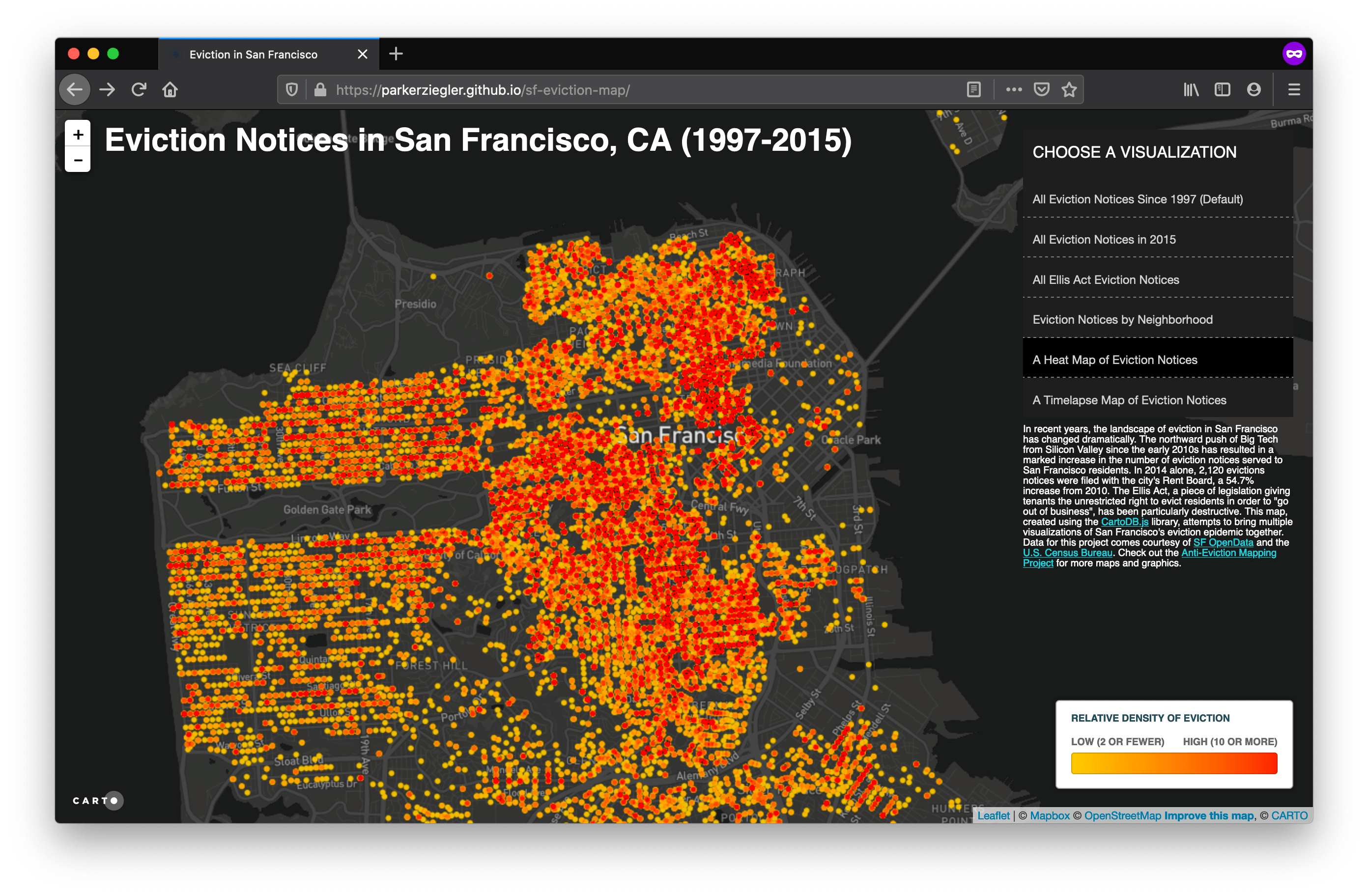
Fortunately, the city of San Francisco has a pretty good resource for understanding demographic and social change within its boundaries – SF OpenData. From here, I was able to find a dataset listing every eviction notice filed between January 1, 1997 and December 31, 2015 in the city of San Francisco. Now, it is important to note here that 1) an eviction notice does not necessarily mean that an eviction occurred, and 2) that not all evictions that occur have legal eviction notices filed for them. Hence, the data visualized in this map is an incomplete picture, one that both adds and takes away; however, it does at least give us a strong starting point for understanding how eviction has moved and shifted across the city over the past 19 years. I also used SF OpenData to grab the neighborhood polygons as a KML file. The data on median house value and demographics comes from the American Community Surveys (2005-2009) and the 2010 Census, reaggregated by the San Francisco Planning Department to fit the boundaries of the neighborhoods (we could've used our nifty AWR tool to do that as well).
So that's a fair bit of data to be dealing with and trying to render on the fly on an interactive map. Due to this requirement on the project, I felt strongly that I needed to use a service that would allow me to create and host a spatial database without having to build and host one from scratch on my own machine. So, instead of going through Leaflet and using GeoJSON data (like Joe and I did for the Zuni map), I decided to use CartoDB. CartoDB offers users a PostGIS backend for creating spatial databases, all of which can be altered and queried using PostgreSQL commands. In this sense, CartoDB essentially acts as a database in the cloud, communicating with an interactive map somewhere else on the internet through use of its APIs. This makes life quite a bit easier, especially for those of us with elementary database design skills.
Now, there are two ways you can build a web map using CartoDB. The quick and dirty way is to go through the Editor, which essentially provides a lot of graphical user interfaces (GUIs) for you to use to create your map. It's pretty and easy-to-use, but it is also rife with defaults that are hard to shake. The harder way, but the one that allows for much more customization, is to use CartoDB's javascript library, CartoDB.js. This library is awesome because it has a lot of built-in functions to help you do the heavy lifting (sort of like tools in ArcGIS), but it allows you to play with these functions or create new ones as you need to. The difficulty, of course, is that not everything that you may want to do is included in the documentation – often, you have to spend hours combing through Stack Overflow to find good hacks for playing with the library. Other times you make wild guesses using some jQuery that somehow work (that happened at least twice for me). It's all a process of trial and error, and thankfully one that gives instantaneous feedback and has a lot of wiggle room. If you're interested in finding good hacks for CartoDB.js, I would recommend starting with this blog post by Daniel McGlone at Azavea, my soon to be mentor for the summer. This map is coded using CartoDB.js.
Click here to access the HTML used to make this map. A lot of things are happening in this map, so I won't go over absolutely everything. Instead, I'm going to focus on the parts that I think are cool or interesting and that may be helpful for future developers. So here we go.
You'll see early on in the code that we have a bunch of <style> tags, many of which have bizarre-looking CSS inside them for different visualization types. These are actually written in CartoCSS, a DSL (domain-specific language) specifically for styling CartoDB web maps. The reason these are included here is that we have a function later in our code, called createSelector, that does some pretty nifty stuff. First, there are event listeners tied to the various buttons on the map (i.e. All Ellis Act Eviction Notices, the Timelapse Map, the Heat Map, etc.), such that when one of these buttons is clicked, the createSelector function is run on that visualization. The function itself actually reaches into the HTML of the selected visualization, finds the CartoCSS attached to that (all that stuff stuck between the <style> tags), applies that CartoCSS to the data, and then adds it to the map. It's a complicated and multi-tiered process, but one that is really useful for applying many different styles to data with a relatively small amount of code.
Another cool element of this map is the custom HTML I wrote for the infowindows and the legends. The infowindows appear when you click on a neighborhood within the "Eviction Notices by Neighborhood" layer. The HTML I wrote for these little guys adds a nice black background to the neighborhood name, and then gives some information about the total number of eviction notices in the neighborhood since 1997, the median home value in 2010, and the racial makeup of the neighborhood in 2010. These are written using mustache templates, which have the benefit of allowing you to pull values from your PostGIS table into the HTML directly. Sweet! You'll also notice that two layers – the neighborhood layer and the heat map layer – have custom legends associated with them. I wired these legends to click events such that they only appear when the layer they describe is active – otherwise, they are turned off. Building custom legends is surprisingly easy; Daniel does a great job explaining how to do it in the blog post linked above. Again, it mostly involves writing some special HTML and CSS and getting your code to reach in there when a certain button is clicked. The powerful part of this functionality is that it really allows you to control the design of your map in a whole new way, such that you're not stuck with the limited options CartoDB gives you by default.
Perhaps the most flashy bit of functionality that this map brings is the timelapse visualization of eviction notices. This layer allows you to either 1) play a ~4-minute animation showing the geographic distribution of eviction notices filed, month by month, from January 1997 to December 2015 (1 month / second), or 2) slide to any month within that time period to see what the distribution looks like 'frozen in time'. Making this visualization required the use of another one of CartoDB's Javascript libraries – Torque.js. Torque.js was developed for visualizing time series data and it's one of the coolest ways I've seen to tell cartographic stories that shift through time. It's almost like being able to fit 216 small multiples into one static layout, while at the same time not completely overwhelming the map reader. Setting up a torque layer is actually relatively simple in CartoDB.js. It mostly involves creating a special Javascript object that calls the timestamp column in your PostGIS table, and then setting some CSS to control how this data changes styles as the animation runs. The most important choice for me was thinking about a color rule to use to show differences between locations with only one eviction versus those with many evictions. For example, let's say that only 1 eviction notice is registered in a building in the city on any given day, while 8 eviction notices are registered in a separate building. With no color rule applied these locations will look the same – only one dot, representing one eviction notice, will be visible. Using a color rules helps to bring out these differences by changing how overlapping dots interact. For this torque visualization, I used a color rule called Lighter, which creates a brighter shade of blue for locations where eviction notices overlap. On a dark background like mine (designed by the highly-talented folks at Mapbox), this effectively draws the map reader's attention towards these areas on the map, allowing them to pick out areas of particularly aggressive displacement.
Ultimately, I feel satisfied with how this map turned out. As someone who is obsessed with details, with color, type, flow, kerning, tracking, visual hierarchy, and data legibility, I think I will always find something to critique about this map. But the time has come for me to move on from it as my last days at Middlebury come to a close. I don't doubt that I will continue to tweak it somewhere down the line, to add or take away or rework, but in this moment I feel a sense of peace with it. It feels like a map I can start to believe in, even if it doesn't feel completely done. And perhaps, at the end of all of this, it's as much of a symbol for me as an object in the world for others to learn from. A symbol that I can teach myself some pretty complicated things and come out with something on the other side. A symbol that I can use my skills to work for social justice, for marginalized voices, for stories that are not told. A symbol that my positionality will always place me in difficult political circumstances around the maps I make, in positions of power where I ought not to have it. Because, really, who am I to make these maps? What stake or experience do I have in these communities? What right do I have to tell these stories? These are questions I have not yet answered, and they are questions that require and demand answering. But I think these questions are also the starting places for critical cartographers. We start by engaging with those very things that challenge and frighten and discomfort us most. We start by attempting to do good while also mucking things up, and we learn from that. We start by using what we know to help others make sense of the world, messy and complicated and contradictory as it is. We start by making maps that we believe in.
Special thanks again to Professor Joseph Holler, Middlebury College Department of Geography, for his unwavering support of this senior research. Thanks are in order as well for Professors Kacy McKinney and Jeff Howarth, the two people who inspired my love for geography and cartography nearly four years ago. And, of course, to my parents, Chris and John, for believing in this kid and all of his wacky dreams, and for always showing me the way.
Thank you for reading. Stay posted for future reflections on my upcoming adventures as a Summer of Maps fellow at Azavea!