Helping Professor Holler Build an Interactive Map for the Zuni Youth Enrichment Project (ZYEP)
Anyone familiar with the contemporary cartographic landscape knows that the climate is shifting swiftly away from the static and towards the interactive. People want maps they can play with, maps that are responsive to user needs, and maps that can be accessed with nothing more than an internet connection and a few directed search terms. Particularly for those seeking to create a community resource (or just something that folks can access on the go) a web map is a good design choice.
Yet I personally still find something uniquely beautiful and important about static, print maps. Perhaps it is Professor Jeff Howarth's voice in the back of my head, reciting a treatise on the pleasure of dwelling with a well-designed map. Perhaps it is the frustration I get from a little extra padding hidden somewhere deep in my CSS, mucking up my legends and selectors. Even so, it is hard to ignore the simple reality that web maps are 1) just plain cool, and 2) a powerful way for democratizing, distributing, and telling stories through geographic data. Their beauty lies in their ability to create multiple vantage points of the same data nearly instantaneously, and to bring these vantage points to the same map in a harmonious way.
For my first foray into interactive / web cartography, I picked up on a project my advisor, Professor Joseph Holler, had started to work on for the Pueblo of Zuni, NM and the Zuni Youth Enrichment Project. Having spent J-term out there collecting data and working with community members to discuss their design needs, Joe graciously decided to include me in the project in April as an assistant developer. The only problem, of course, was that I had no familiarity with the library we'd be using to create the map – Leaflet.
But as I've discovered throughout this senior research, the process of self-learning doesn't hinge so much on your prior familiarity or formal instruction with the tools. It really hinges more on:
- Your ability to find good, reliable help at your level
- The availability of an example to base your work on
- The stubbornness to persist in the face of setbacks
Fortunately, I had all three to help me with this project. Because Leaflet is an open-source library maintained and improved by a global user community, there is a strong support community for it online (particularly on Stack Overflow). People have figured out and shared all kinds of nifty hacks to make challenging things happen; moreover, their explanations of their code are surprisingly coherent for a programming language that can so easily behave in unpredictable ways.
Joe was also kind enough to provide a worked example of a Leaflet map he had made so that I could parse through its different elements and understand how they work. While things like pulling map tiles from a tile server or rendering vector features from a GeoJSON object are not particularly difficult to pick up, other bits of interactivity (turning layers on and off, changing layer symbology based on multiple variables, etc.) can be. Lastly, I drew on a healthy dose of stubbornness to make it through this project. Each fix often introduced its own problems, and being able to maintain a positive trajectory really came down to not getting discouraged. This also entailed celebrating every little victory I could get.
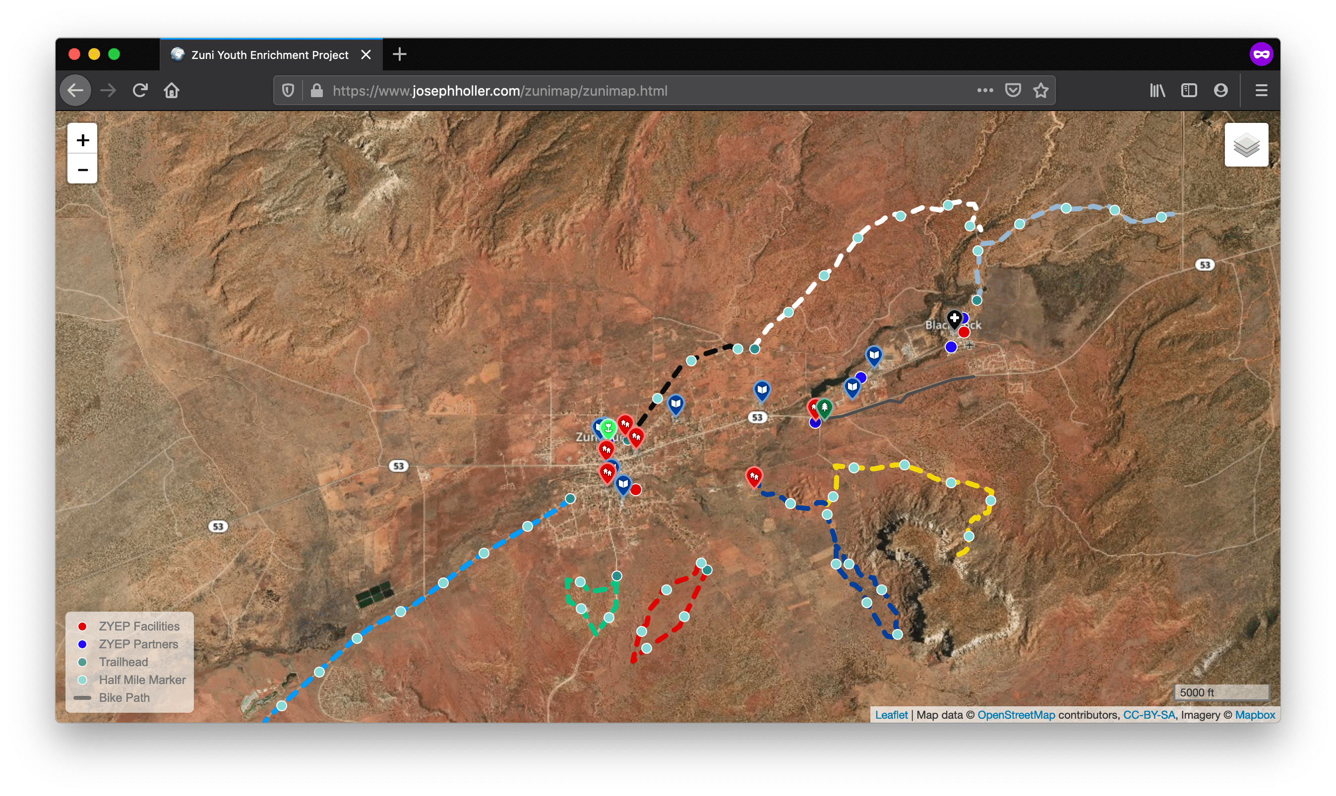
You can check out the final map on Joe's website. Let's break down what's happening in the code here. First, the map has two base layers that users can toggle between, the topo map coming from the USGS and the satellite map from Mapbox. Including both these maps helps the user acquire different information on the landscape, from topography and geomorphology to color. These two base maps are controlled through an array that is iterated through when users make a selection from the layer control in the top right. On top of the base maps are 5 different GeoJSON vector layers, one for trails, playgrounds, landmarks, distance markers, and bike paths, respectively. These files are basically not much more than an array of coordinates, read by Leaflet's L.geoJson function and placed on the map in the correct location. These are also controlled through a two-dimensional array passed to the layer control.
The interesting thing here is that two of these layers are tied to the legend, such that the legend actually changes as layers are added and removed. This is done by connecting a legend update function to an array of HTML items, and then using a for loop that updates the inner HTML of the legend with its corresponding array entry when those layers are turned on and off. Another cool feature of this map is the use of event listeners to affect how the map behaves when the user hovers and clicks on objects. This is fairly standard practice in web maps, but one that helps to signal to the user what feature(s) they're interacting with in any given moment. In our case, hovering over the trails and distance markers changes their color to black (to show they are actively highlighted); hovering on any feature on the map also pops up a label with the feature's name. This is a powerful bit of interactivity, but also one that requires some careful thinking – for example, what happens when a user moves their mouse to another feature? This is where Javascript can get tricky, because we also need to wire functions for removing styles when the user ends their interaction with a given feature.
One of the biggest challenges I originally faced with this map was pulling in Mapbox's Maki markers. To do this, I relied on a Leaflet plug-in developed by @jseppi on Github. To get this bit of functionality required drawing on Leaflet's L.icon function and setting some custom CSS to style them with appropriate colors and sizes. Finally – and this is probably the coolest thing happening on the map – the actual styling applied to the trails layer changes when the basemap changes. I have to give credit here to Professor Holler for getting this to work. When we looked at how the trails layer looked against the USGS topo map, we found that a few of the trails were getting lost in the background due to hue and brightness similarity. To deal with this, we wired up a function that does a few things – 1) checks if the USGS basemap is active, 2) checks if the trails layer is on, and 3) if these two conditions are met, places a semi-transparent reddish-brown line beneath the trails. This effect gives just enough contrast to bring the trails layers to the top of the visual hierarchy.
Ultimately, I'm coming away from this project with a deep sense of accomplishment. To be able to learn a new library from scratch, to write code in three different languages (HTML, CSS, and Javascript) for the same map, and to actually have it work feels remarkable. But more importantly, this project has felt significant from the beginning because it will exist as an object in the world that people will actually use. It will have some utility for the community it serves, helping folks to locate and use services that can help them to live healthier lives. When I'm sitting hunched over my computer here in the GIS lab at Middlebury, it is this thought that excites me most, that makes all of this effort and difficulty and stress worth it. I think every cartographer dreams of having their work mean something beyond a temporary glance or a passing comment, beyond, "Oh hey, look, a map!" I think this project, like those I worked on for my cartographic design seminar, has that added dimension of meaning, of significance. It is, I hope, a map that matters.
Special thanks again to Professor Joseph Holler for his ingenuity and assistance on the development of this map, and for spearheading this project with ZYEP.